
Overview
Susan Elizabeth Gagliardi introduces the digital humanities mapping series "MAP IT | Little Dots, Big Ideas."
During the spring semester of 2016, Emory University's "MAP IT | Little Dots, Big Ideas" series featured lectures by humanists who are at different stages of their careers and are engaged in cutting-edge digital mapping projects.
Introduction
By offering new tools to develop research questions, analyze data, and publish findings, digital mapping is transforming the humanities. During the spring of 2016, Emory University's "MAP IT | Little Dots, Big Ideas" series featured lectures by humanists who are at different stages of their careers and are engaged in cutting-edge digital mapping projects. Their work represents a variety of approaches for joining geo-spatial analysis and humanistic inquiry. The media-rich lectures published here by Southern Spaces offer fresh perspectives on landscape photography, soundscapes, cities, spheres of cultural influence, and the historical art market.
In a world where maps abound on pocket devices and where we make wayfinders with a few clicks on our screens, we may forget the complexities of mapmaking and misunderstand the information maps convey. At the 2015 American Association of Geographers conference in Chicago, geographer Janet Speake asserted that as the public gains access to robust digital spatial technologies, it decreasingly relies on geographers' expertise in evaluating data and arguments embedded in maps. The result is a proliferation of maps unreliable in terms of data and analysis but dangerously compelling in their visual support of arguments.

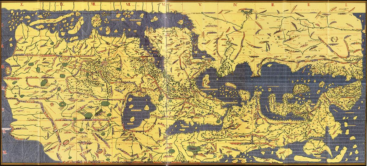
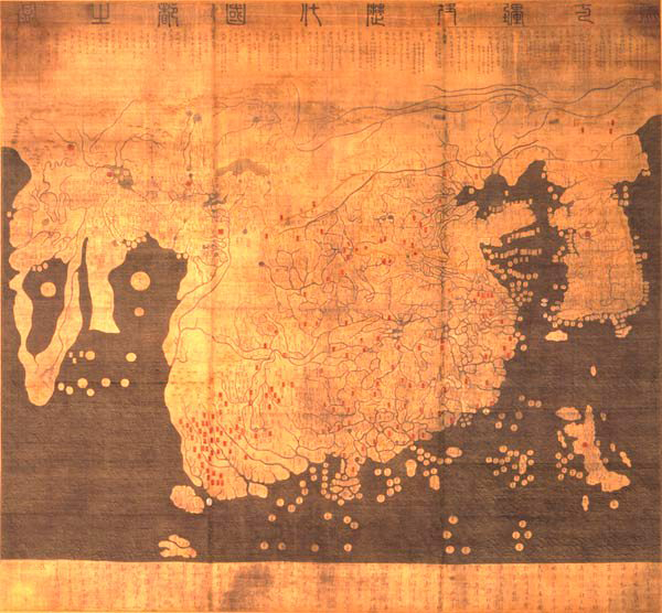
Maps represent makers' decisions about perspective, scale, and features of an area.1See also Monmonier, Mark. How to Lie with Maps, second edition, (Chicago: University of Chicago Press, 1996). For example, Muhammad al-Idrisi oriented his 1154 world map in a direction that reverses present-day common placement of north at the top of maps and south at the bottom.2See B.L. Gordon, "Sacred Directions, Orientation, and the Top of the Map." History of Religions 10, no. 3 (1971): 225; Arthur Hunt, "2000 Years of Map Making." Geography 85, no. 1 (2000): 6. Yi Hoe and Kwon Kun's fifteenth-century Kangnido map resembles today's maps with north at the top of the map, and it illustrates a southward pointing continent of Africa. Yet the blue space in the center of Africa suggests the mapmakers conceived of the continent as a landmass encasing a giant body of water.3See Gari Ledyard, "The Kangnido: A Korean World Map, 1402." In Circa 1492: Art in the Age of Exploration, edited by Jay A. Levenson (Washington DC: National Gallery of Art, 1991): 329–332. Long before the emergence of geographic information systems (GIS) or other digital mapmaking platforms, cartographers' images of the world indicated a range of possibilities for conceiving geography.

As the Indian government's recent efforts to regulate that country's maps makes clear, maps are not neutral documents. A declaration form for entry into India distributed to passengers on a June 2015 flight lists items prohibited for import, including "maps and literature where Indian external boundaries have been shown incorrectly." More recently, the Indian government has sought to exert greater control over map production and circulation. A Times of India report describes the Indian Ministry of Home Affairs's proposed Geospatial Information Regulation Bill 2016 that "makes it mandatory to take permission from a government authority before acquiring, disseminating, or publishing or distributing any geospatial information of India." The Times report explains that passage of the bill would mean "use of the map of India would require government permission first."4See Times of India. "Geospatial Information Bill 2016: All You Need to Know." TOI Tech (May 13, 2016): http://timesofindia.indiatimes.com/tech/computing/Geospatial-Information-Bill-2016-All-you-need-to-know/articleshow/52256772.cms; Arup Dasgupta, "New Geospatial Bill Raises Questions on Private Industry Use, Academic Research, and Digital India." The Wired (May 10, 2016): http://thewire.in/35044/new-geospatial-bill-raises-a-hundred-questions-on-private-industry-use-academic-research-and-digital-india/.

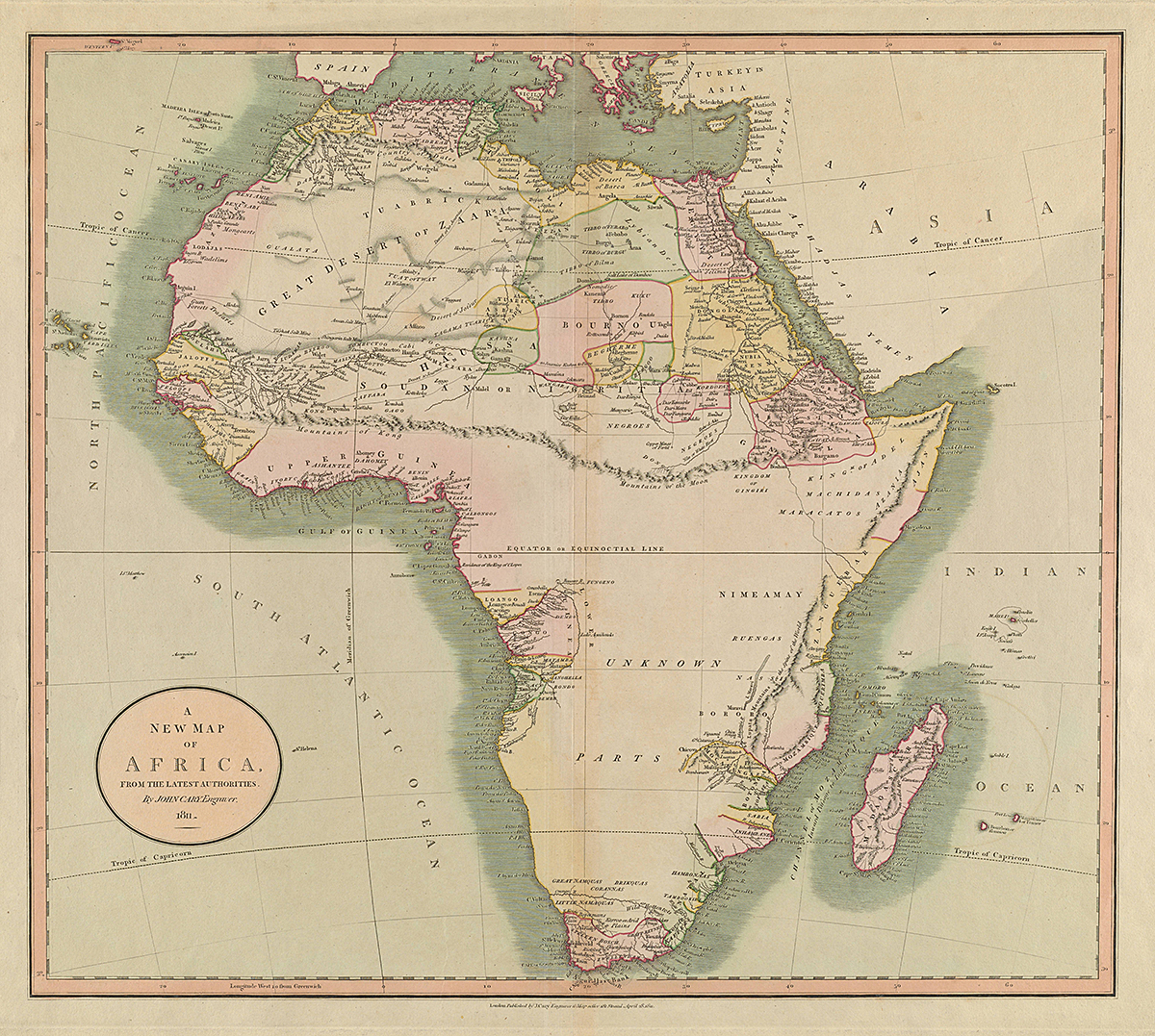
While maps differ in their illustration of, and arguments about, the world's geography, mapmakers have long sought accuracy, often an elusive goal. Geographers Thomas Bassett and Philip Porter (1991) examined nineteenth-century maps illustrating a great chain known as the Kong Mountains in West Africa.5See also Emmanuel Terray, "Grandeur Et Décadence Des Montagnes De Kong (Decline and Fall of the Kong Mountains)." Cahiers d'Études Africaines 26, no. 101, 102 (1986): 241–49. Present-day maps do not feature these mountains. "What's intriguing about the Kong Mountains," explain Bassett and Porter, "is that they never existed except in the imaginations of explorers, mapmakers, and merchants."6Thomas Bassett and Philip Porter, "'From the Best Authorities': The Mountains of Kong in the Cartography of West Africa." The Journal of African History 32, no. 3 (1991): 367.
A single image or map may prompt multiple readings. Drawing on fieldwork they conducted separately in present-day Democratic Republic of the Congo in the 1970s and 1980s, Mary Nooter Roberts and Allen Roberts (1996, 2007) explain how lukasa memory boards record historical and spatial information. Specialists trained in reading the boards assess complex patterns to navigate landscapes, recount histories, or describe personal relationships. Readings vary from specialist to specialist, and each reading may be valid.
Historical geographic information systems (HGIS) and digital maps may also present opportunities to analyze complex data and arrive at different conclusions. Geographer Anne Kelly Knowles (2008: 5) explains that "digital historians want to encourage readers to engage with evidence as they see fit and draw their own conclusions."7Anne Kelly Knowles, "GIS and History." Placing History: How Maps, Spatial Data, and GIS are Changing Historical Scholarship (Redlands: ESRI Press, 2008): 5. Responding to Knowles's observations about HGIS, Emory graduate student Madison Elkins asked, "Can we read this 'trait' as something much more, as a radical shift in authority in which authors or creators no longer control interpretations of data and phenomenon but allow, and even encourage, user-directed interpretations and arguments?"8Personal communication, March 15, 2016.
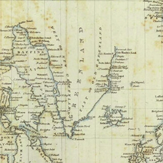
. Courtesy of the David Rumsey Map Collection.")
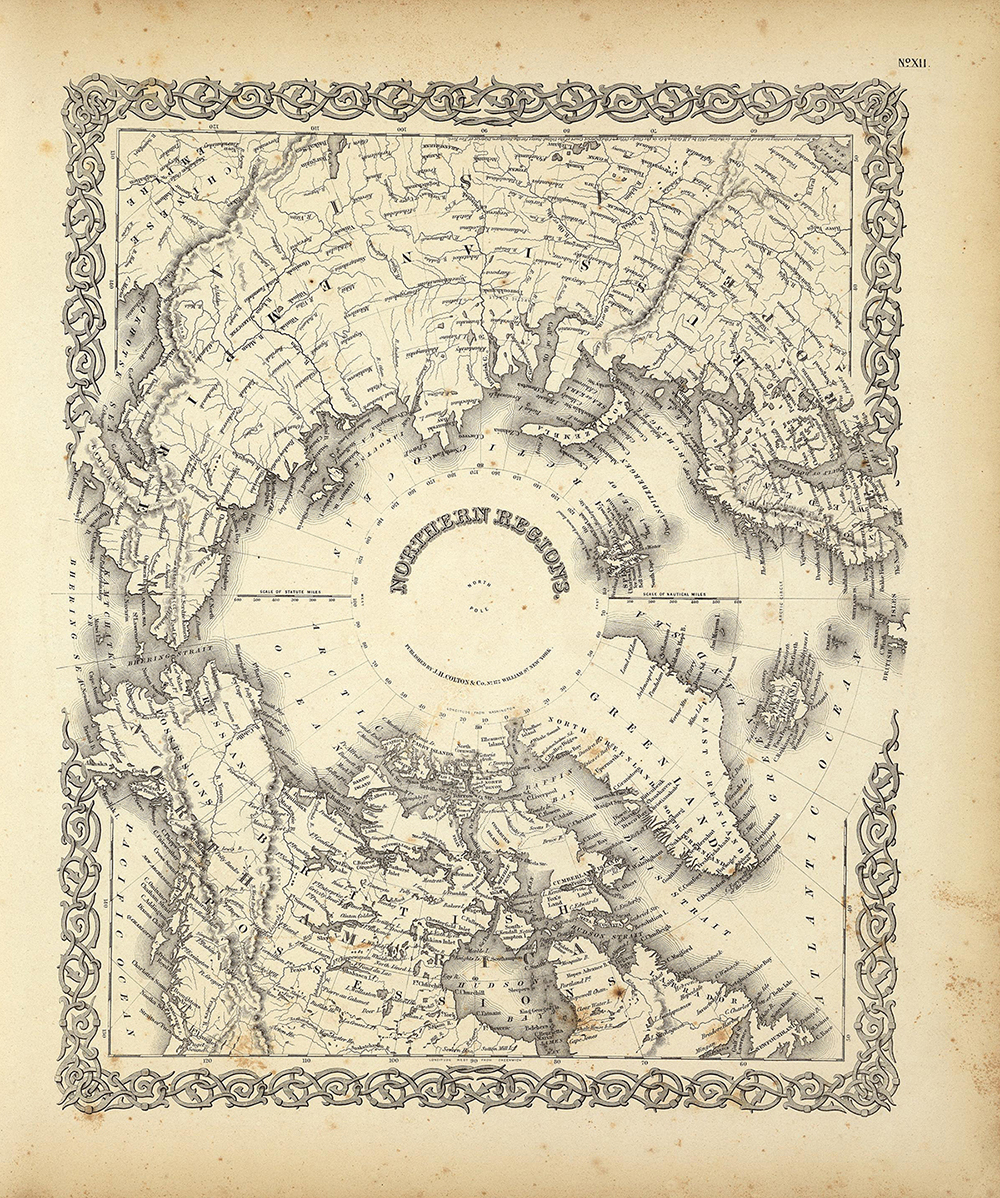
Northern Regions, 1855. Originally published in Colton's Atlas Of The World, Illustrating Physical And Political Geography (New York: J.H. Colton And Co., 1855). Courtesy of the David Rumsey Map Collection.
Through their MAP IT series lectures, scholars generated discussion about maps, the construction of arguments, and how digital technologies can spark new questions or understandings. In the opening lecture, "Tracing The Arctic Regions: Mapping Nineteenth-Century Photographs of Greenland," George Philip LeBourdais acknowledges an initial eagerness to identify precise locations for icebergs photographed for William Bradford's late nineteenth-century book, The Arctic Regions. Despite scientific aspects of Bradford's mission, he did not record exact location information for photographs of icebergs and other features of the Arctic that he reproduced in The Arctic Regions. A doctoral candidate in the Department of Art History at Stanford University, LeBourdais set out to map uncertain locations of Bradford's photographs of icebergs, features that, due to their very nature, move and change. LeBourdais recognized that trying to map exact locations for the photographs misses the point of Bradford's project. LeBourdais's decision not to map every image, focusing instead on core sites clearly identifiable in the photographs and their role within the book's narrative, provides a caution about the allure of making digital maps and the precision they seem to imply.

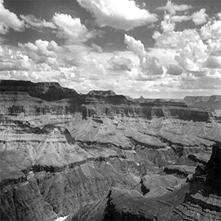
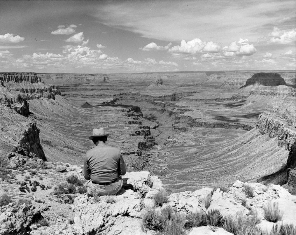
In other instances, using digital tools to find exact locations for photographs of landscapes and to analyze the images may help reframe understandings of how a photographer conceived and presented particular spaces. Nicholas Bauch's lecture, "Enchanting the Desert: Visualizing the Production of Space at the Grand Canyon" features a collection of Henry G. Peabody's 1899–1930 photographs of the Grand Canyon and Bauch's study of them. As geographer-in-residence at Stanford University's Spatial History Project, Bauch completed the born-digital monograph Enchanting the Desert (2016) which investigates Peabody's views of the canyon and how they contribute to present-day conceptions of it. Rather than present a linear argument, Bauch's monograph invites readers to explore Peabody's photographs and their relation to historical and ongoing productions of space within an interactive environment of analytical texts and images. Bauch's Enchanting the Desert is the pilot publication in Stanford University Press's digital monograph publishing initiative.
Other scholars in the "MAP IT | Little Dots, Big Ideas" series demonstrate how digital mapping has led to unanticipated findings or reshaped narratives. In "Seeing Sound: Mapping Florentine Soundscapes," Niall Atkinson explains that as a result of digital mapping, he came to recognize that people in Renaissance Florence created mental maps of the city's sounds. Atkinson, assistant professor of art history at the University of Chicago, demonstrates how a single paragraph in a 1355 statute inspired him to examine the importance of bells in the city. Prior to making digital maps, Atkinson posited that parish churches sat at, and their bells rang from, the geographic centers of the neighborhoods of parishioners the churches served. After he mapped locations of parish churches and available census data, Atkinson identified a less straightforward geographic relationship between churches and constituents. Atkinson concluded that the city's residents constructed their own mental geographies based on the city's soundscapes.

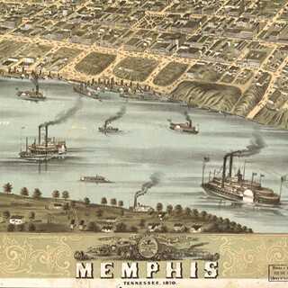
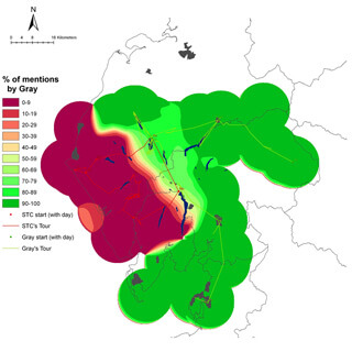
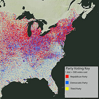
S. Wright Kennedy, doctoral candidate in the history department at Rice University, presents four different examples of how HGIS and spatial analysis can lead to new findings in "The Potential of Historical GIS and Spatial Analysis in the Humanities." His study of the placement of Atlanta's streetcar lines between 1871 and 1902 provides new insight into the city. After mapping the streetcar lines and the populations they serviced, Kennedy noticed zigzags that seemed to counter the idea that streetcars operate most efficiently when they follow straight lines. Kennedy explains that "on a whim, I decided to map out where the city council members lived." He found that the zigzagging lines brought the streetcars in close proximity to the houses of various city officials and best served council members on the Streets Committee, which oversaw the street railway companies. Kennedy's analyses of the eighteenth-century transatlantic slave trade, the 1878 yellow fever epidemic in Memphis, Tennessee, and collaborative development of an open-access web-based map for study of Rio de Janeiro, Brazil, also demonstrate productive possibilities for HGIS.
Ellen Prokop, associate photoarchivist at the Frick Art Reference Library in New York City and an art historian who specializes in Spanish art of the sixteenth and seventeenth centuries, closed the lecture series with "A Modern Old Master? Using Historical GIS to Chart El Greco's Influence on the French Avant-Garde" (no video available for this lecture). Curious about the validity of the longstanding art-historical narrative that credits El Greco with inspiring developments in European art, Prokop turned to HGIS to create digital maps in order to evaluate the temporal and spatial distribution of sixteenth-century Spanish artist El Greco's work in Paris. Prokop's maps suggest the improbability of this story and prompt reassessment of El Greco's relationship to modernist artists in Europe in the late nineteenth and early twentieth centuries. Her maps, still works-in-progress, fuel discussion about the ability of maps to capture ambiguity and convey complexity.
![Detail from El Greco's The Opening of the Fifth Seal [the Vision of Saint John] (ca. 1608–1614). Courtesy of Flickr user cea+. Creative Commons license CC BY 2.0.](https://i0.wp.com/southernspaces.org/wp-content/uploads/2019/07/gagliardi-007-elgreco.jpg?ssl=1 "Detail from El Greco's The Opening of the Fifth Seal [the Vision of Saint John] (ca. 1608–1614). Courtesy of Flickr user cea+. Creative Commons license CC BY 2.0.")
Digital mapping projects are time- and resource-intensive collaborative endeavors that, if executed well, can reconfigure methods and knowledge. The projects may also contribute to new techniques that challenge the precision that GIS and other mapping technologies seem to demand. At the 2016 Association of American Geographers conference in San Francisco, several panels emphasized the need for mapmaking tools that account for ambiguity and that better capture the complexities of human experiences. Uncertainty remains difficult to present with visual representations of geographic space. For example, the "Crime & Punishment: Mapping Ambiguity" map published on Mapping St. Petersburg: Experiments in Literary Cartography requires a key and text to explain points that are indications of unspecified locations or spatial anomalies.

"MAP IT | Little Dots, Big Ideas" brought together scholars who are part of a sea change in humanities scholarship.9This development in the humanities has also provoked controversy. For example, see Daniel Allington, Sarah Brouillette, and David Golumbia, "Neoliberal Tools (and Archives): A Political History of Digital Humanities," LA Review of Books, May 1, 2016, https://lareviewofbooks.org/article/neoliberal-tools-archives-political-history-digital-humanities/. Art historians and other humanists are using robust digital technologies to ask questions, assess information, and publish findings. In June 2015, art history's US-based professional body, the College Art Association (CAA), appointed Pamela Fletcher as its first field editor in digital humanities and art history for its reviews publication, caa.reviews. In February 2016, Duke University's Wired! Lab brought together scholars from the United States and abroad for its one-day symposium, Digital Art History Symposium: Apps, Maps & Models. And in October 2016, the University of Maryland's Department of Art History and Archaeology will hold Art History in Digital Dimensions, a three-day symposium supported by the Getty Foundation and Samuel H. Kress Foundation. At Emory, "MAP IT | Little Dots, Big Ideas" marked one moment in the ongoing transformation of art-historical methods. 
About the Author
Susan Elizabeth Gagliardi is assistant professor of art history at Emory University and creator of the digital project Mapping Senufo. Her publications include Senufo Unbound: Dynamics of Art and Identity in West Africa (Cleveland: The Cleveland Museum of Art; Milan: 5 Continents Editions, 2014).
Cover Image Attribution:
A New Map of Africa, the Latest Authorities, 1811. Engraving by John Cary. Originally published in Cary's New Universal Atlas, London, 1808. Courtesy of the Thomas Bassett Personal Collection, http://imagesearchnew.library.illinois.edu/cdm/singleitem/collRecommended Resources
Text
Bassett, Thomas J., and Philip W. Porter. "'From the Best Authorities': The Mountains of Kong in the Cartography of West Africa." The Journal of African History 32, no. 3 (1991): 367–413.
Gordon, B. L. "Sacred Directions, Orientation, and the Top of the Map." History of Religions 10, no. 3 (1971): 211–27.
Hunt, Arthur. "2000 Years of Map Making." Geography 85, no. 1 (2000): 3–14.
Knowles, Anne Kelly. "GIS and History." Placing History: How Maps, Spatial Data, and GIS are Changing Historical Scholarship. Redlands: ESRI Press, 2008.
Ledyard, Gari. "The Kangnido: A Korean World Map, 1402." In Circa 1492: Art in the Age of Exploration, edited by Jay A. Levenson, 329–332. Washington DC: National Gallery of Art, 1991.
Monmonier, Mark. How to Lie with Maps. Second edition. Chicago: University of Chicago Press, 1996.
Roberts, Mary Nooter, and Allen F. Roberts. Luba: Visions of Africa. Milan: 5 Continents Editions, 2007.
———. Memory: Luba Art and the Making of History. New York: Museum for African Art, 1996.
Terray, Emmanuel. "Grandeur Et Décadence Des Montagnes De Kong (Decline and Fall of the Kong Mountains)." Cahiers d'Études Africaines 26, no. 101, 102 (1986): 241–49.
Web
Allington, Daniel, Sarah Brouillette, and David Golumbia. "Neoliberal Tools (and Archives): A Political History of Digital Humanities." Los Angeles Review of Books, May 1, 2016. https://lareviewofbooks.org/article/neoliberal-tools-archives-political-history-digital-humanities/.
Dasgupta, Arup. New Geospatial Bill Raises Questions on Private Industry Use, Academic Research and Digital India." The Wired, May 10, 2016. http://thewire.in/2016/05/10/new-geospatial-bill-raises-a-hundred-questions-on-private-industry-use-academic-research-and-digital-india-35044/.
The Times of India. "Geospatial Information Bill 2016: All You Need to Know." TOI Tech, May 13, 2016. http://timesofindia.indiatimes.com/tech/computing/Geospatial-Information-Bill-2016-All-you-need-to-know/articleshow/52256772.cms.
Similar Publications
| 1. | See also Monmonier, Mark. How to Lie with Maps, second edition, (Chicago: University of Chicago Press, 1996). |
|---|---|
| 2. | See B.L. Gordon, "Sacred Directions, Orientation, and the Top of the Map." History of Religions 10, no. 3 (1971): 225; Arthur Hunt, "2000 Years of Map Making." Geography 85, no. 1 (2000): 6. |
| 3. | See Gari Ledyard, "The Kangnido: A Korean World Map, 1402." In Circa 1492: Art in the Age of Exploration, edited by Jay A. Levenson (Washington DC: National Gallery of Art, 1991): 329–332. |
| 4. | See Times of India. "Geospatial Information Bill 2016: All You Need to Know." TOI Tech (May 13, 2016): http://timesofindia.indiatimes.com/tech/computing/Geospatial-Information-Bill-2016-All-you-need-to-know/articleshow/52256772.cms; Arup Dasgupta, "New Geospatial Bill Raises Questions on Private Industry Use, Academic Research, and Digital India." The Wired (May 10, 2016): http://thewire.in/35044/new-geospatial-bill-raises-a-hundred-questions-on-private-industry-use-academic-research-and-digital-india/. |
| 5. | See also Emmanuel Terray, "Grandeur Et Décadence Des Montagnes De Kong (Decline and Fall of the Kong Mountains)." Cahiers d'Études Africaines 26, no. 101, 102 (1986): 241–49. |
| 6. | Thomas Bassett and Philip Porter, "'From the Best Authorities': The Mountains of Kong in the Cartography of West Africa." The Journal of African History 32, no. 3 (1991): 367. |
| 7. | Anne Kelly Knowles, "GIS and History." Placing History: How Maps, Spatial Data, and GIS are Changing Historical Scholarship (Redlands: ESRI Press, 2008): 5. |
| 8. | Personal communication, March 15, 2016. |
| 9. | This development in the humanities has also provoked controversy. For example, see Daniel Allington, Sarah Brouillette, and David Golumbia, "Neoliberal Tools (and Archives): A Political History of Digital Humanities," LA Review of Books, May 1, 2016, https://lareviewofbooks.org/article/neoliberal-tools-archives-political-history-digital-humanities/. |